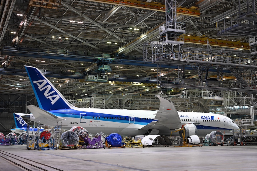
Japan’s MLIT Issues Business Improvement Recommendation to ANA Over Safety Violations
Korean Air has revamped its corporate identity for the first time in 41 years.
The existing Taegeuk mark has been enhanced with design elements that incorporate modern and minimalist trends, creating a sophisticated image. The color is dark blue, indicating a premium feel. The logo comes in three variations: with the symbol and “KOREAN AIR,” with the symbol and “KOREAN,” and with the symbol alone.
The 3D motif in the background is inspired by the dynamic curves of the Taegeuk pattern, using light blue as the base color and red as the accent color. This will be applied to check-in screens, mobile Skypass cards, the website, etc. The 2D pattern imagines the soft curves of Korea’s natural mountains and the Taegeuk, and will be used on fabrics and paper where 3D usage is difficult.
The Taegeuk mark signifies dynamic energy and beauty, while the “KOREAN AIR” text features soft curves like brushstrokes and delicate spacing of letters, representing Korean elegance in a modern way. The aircraft’s light blue has been changed to a modern metallic tone, with soft curves designed to flow along the fuselage.
The newly designed Boeing 787-10 aircraft will start operating on March 12 for Seoul/Incheon to Tokyo/Narita flight KE703 and the return Seoul/Incheon flight KE704.